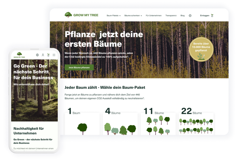
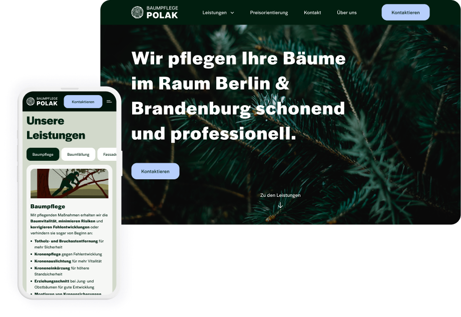
Landing page for a local business
As a freelancer I worked in close collaboration with the business owner and delivered the user interface design, the content and the branding.
I also implemented the design in the Elementor Builder to bring the landingpage live.
Time frame
May 2023 - 3 weeks on part-time basis
Business objective
The local business aims to radiate following values with the web presence:
Sustainable
Vigorous
Ambitious
Trustworthy
Reliable
Attentive
Approachable
Precise
Neat
Clear
Professional
Proficient
Well-versed
Grounded
Solid
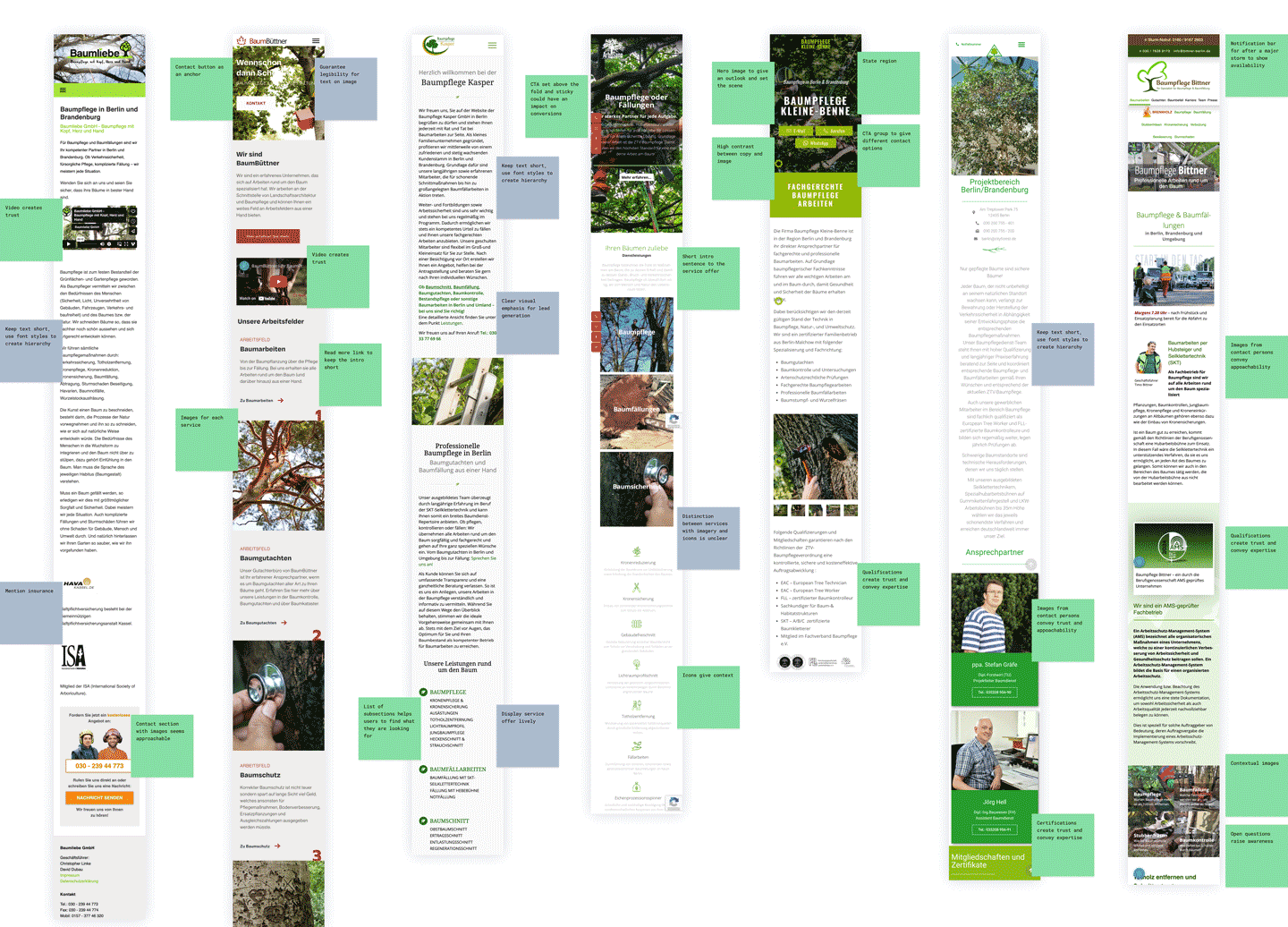
Competitive analysis
In order to understand the field of business more, I aligned on known competitors with the client and investigated their website structure. It also revealed inspirations and standards in the industry to refrain from.
The analysis also indicated that the color palette could be a way to set the landing page apart from the competitive businesses.
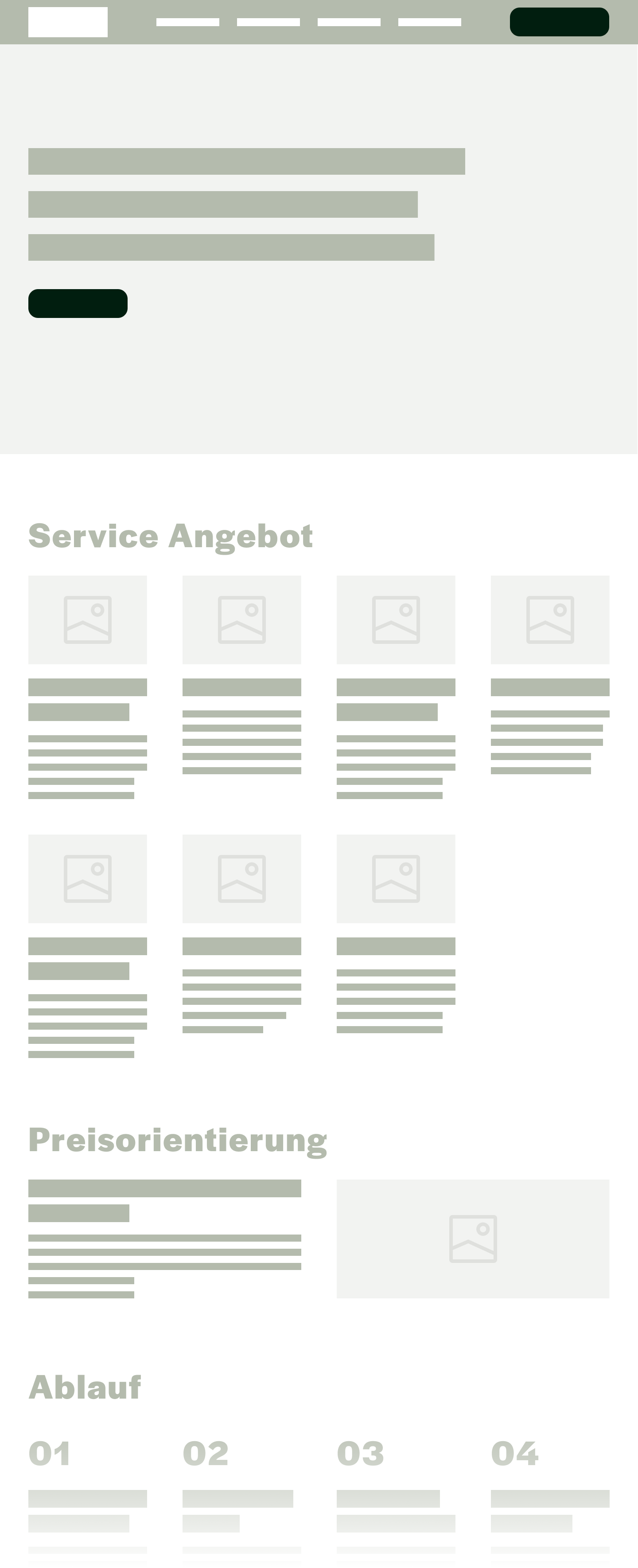
Visual hierarchy

Logo creation
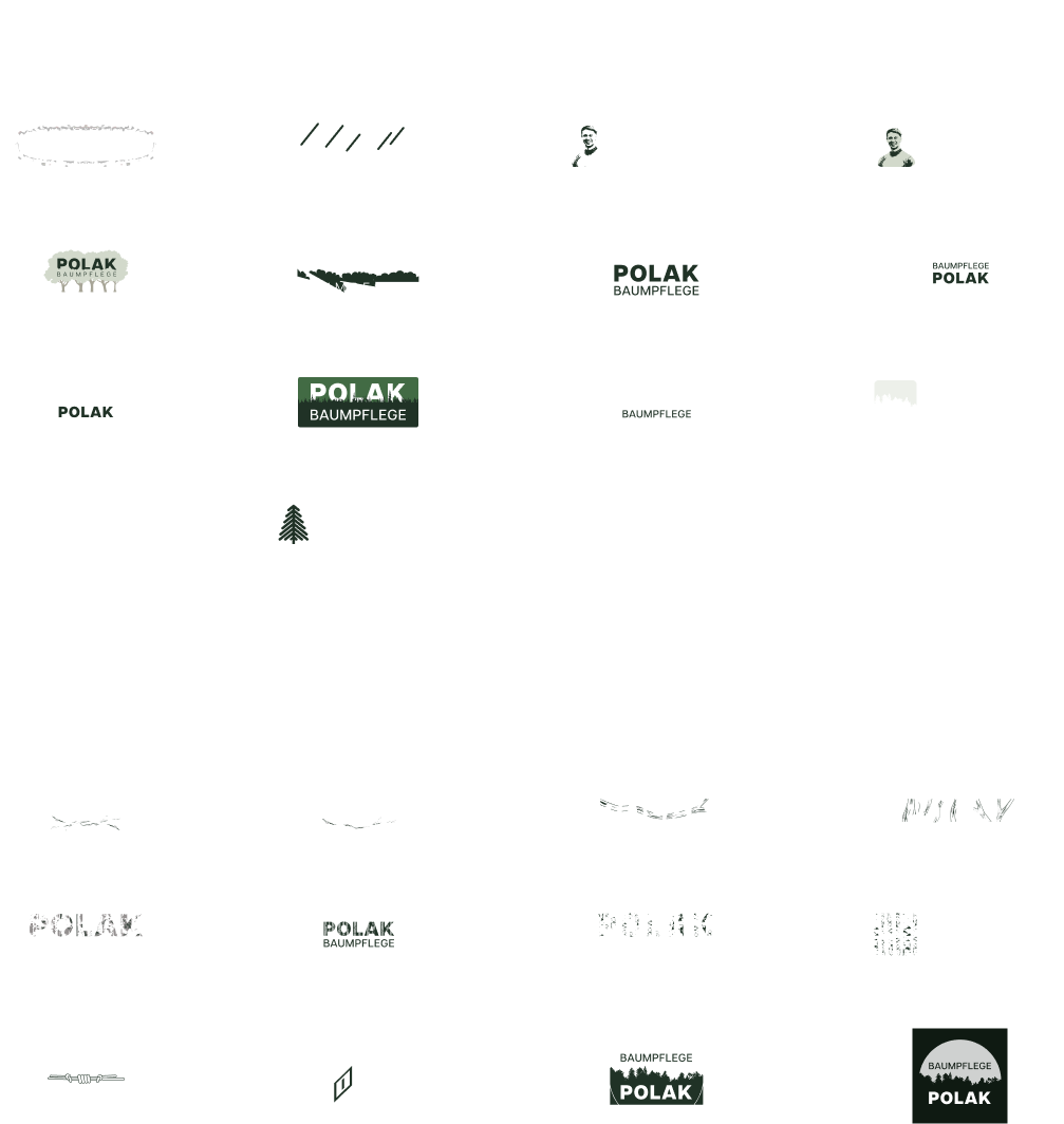
Chosen logo design
I delivered options for the hero section which is pivotal to create a first impression for the users.
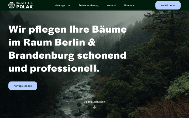
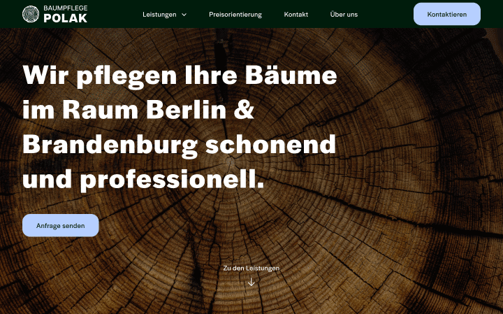
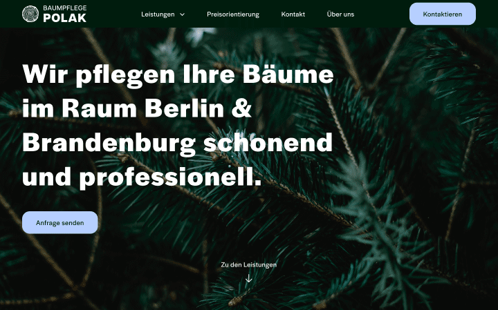
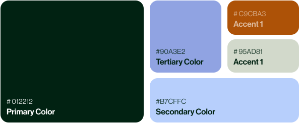
Color palette
As much as other brand elements, the color pallette aims to communicate trustworthiness, clarity and closeness to nature.
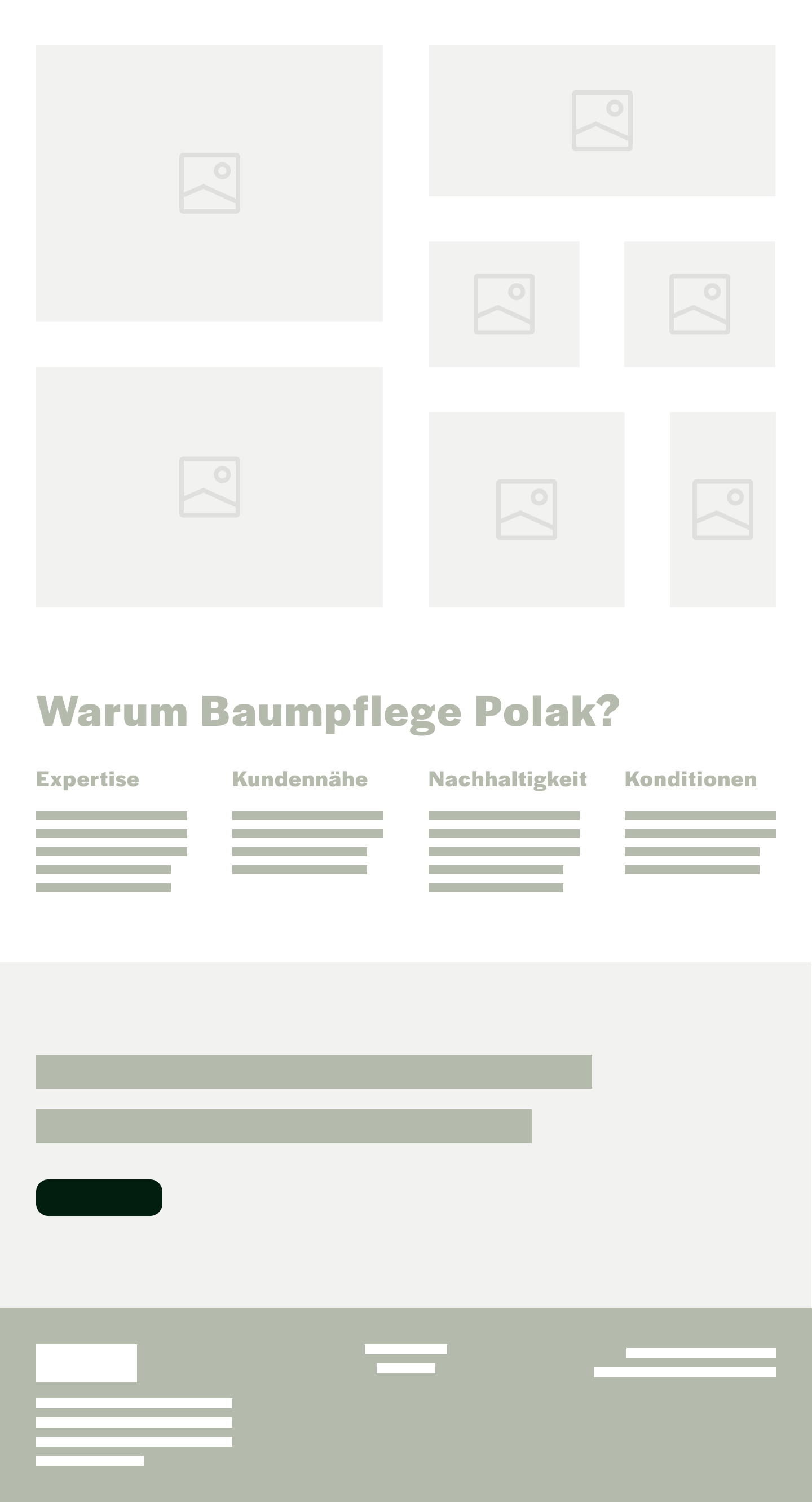
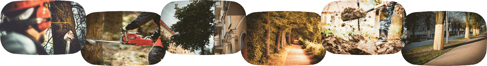
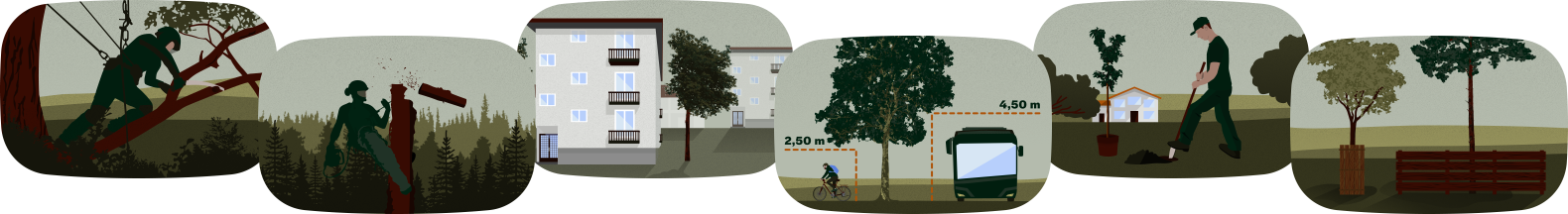
Service imagery
The most relevant section for private customers is to present the range of arborist services in a crisp manner.
In the first draft, I used real imagery to communicate the six service offers such as maintenance and felling. However, the imagery looked too technical and severe.
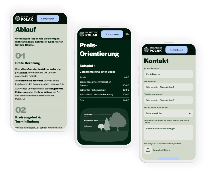
Go live and testing
I implemented the design in the Wordpress builder Elementor.
I carried out usability tests and the most significant feedback was that the chosen animations on scroll to make sections appear one by one were not accepted. I removed the animations to streamline the user experience.