Progress indicator exploration
Project synopsis
In this personal project I showcase how I would improve an existing feature in one sprint. The goal was to investigate innovative ways of reassuring users of their progress when filling out a form.
My role
I designed the user interface variations and carried out the usability testings. The testings were both on-site and remote.
Time frame
June 2023 - one week
What is a progress indicator for?
A determinate progress indicator informs users about the duration and the completion of a process. It animates along the length of a fixed track from left to right. An animation not only captures the user’s attention, but it also makes an activity more tolerable to the user by reducing uncertainty.
Project step by step
Step 01
Designing progress indicators
The first phase was a design exploration of linear progress indicators. I refrained from desk research on this design element on purpose, because I did not want to be impacted by existing solutions. I used familiar UI patterns as well as novel ways to communicate completion of an activity in a digital product.
Step 02
Embed progress indicators in relatable use case
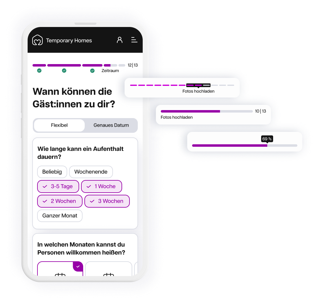
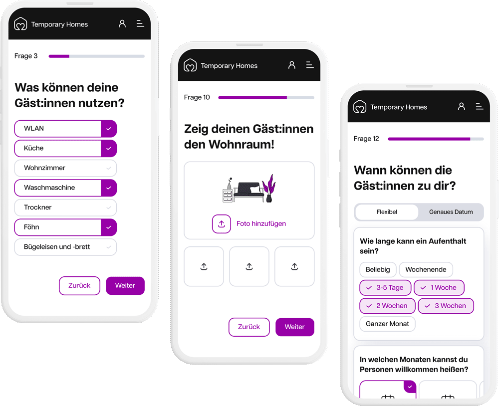
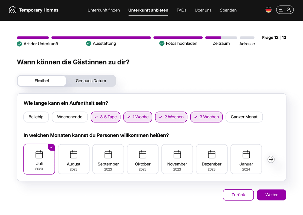
In order to test the design variations, I came up with a form for a fictitious use case that I am passionate about. I created example screens for a platform of providing temporary accommodation to unknown guests, such as refugees.
Showing the example screens in high fidelity design was necessary to see the context of use and let the participants feel how the progress comes about.
Step 03
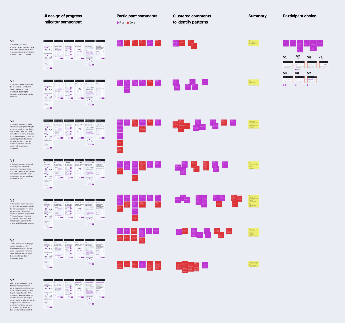
Qualitative testing
I invited six participants to a usability testing session with mobile devices. Four of the testings were carried out on on-site and two remotely. To avoid bias, the order of testing the different variations one by one was randomised for each session.
Eventually, they gave concluding feedback one the UI elements while seeing the 7 progress indicator variations next to another and to choose the most usable one.
Eventually, they gave concluding feedback one the UI elements while seeing the 7 progress indicator variations next to another and to choose the most usable one.
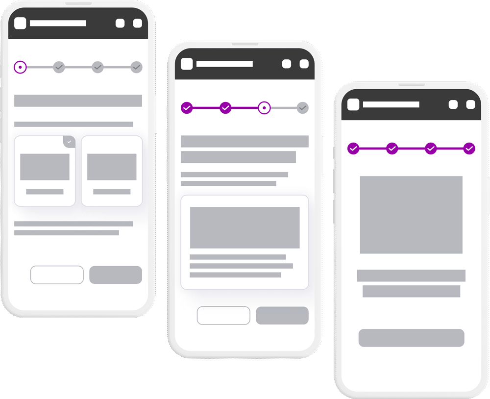
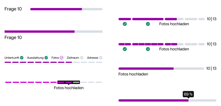
Variation 01
In the most basic version, a progress indicator consists of a bar filling a track. The ascending question number also indicates the users’ progress throughout the form.
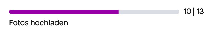
Variation 02
In comparison to the first variation, the bar expands full width and mentions the current state underneath, displaying the elements in a different information hierarchy.
Variation 03
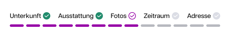
In this design the track is divided into same-sized steps reflecting the amount of questions a user has to walk through. It also uses the UI element of checkmarks for current and completed topics, for example, uploading pictures.
Variation 04
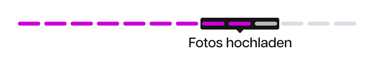
In this design the track is also split according to the number of questions. A rectangular shape rims a set of questions and anchors its respective topic with a tail to give more context and a feeling of control to the users.
Variation 05
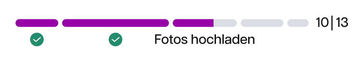
Different sized segments of the bar reflect the amount of questions assigned to a subcategory. The topic appears underneath the active section. Once a section is completed, a checkmark highlights the progress.
Variation 06
The the respective subcategory is mentioned underneath for providing more context. Also the users’ progression in the form is made visible with the current and total amount of questions in absolute numbers.
Variation 07
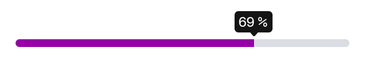
Also a familiar design is to translate the progression into percentages according to the level of completion. Showing the percentages in an animated way as a tag makes use of the “Goal gradient effect”: When users are getting closer to reaching a goal, they work harder to complete it.
Step 04
Derive insights
As standard for a usability testing, I clustered the user comments to identify patterns and paraphrased the findings.
Findings
It is a balancing act to apply a logic that users are familiar with and that adds value with the right level of detail. Here are the four main findings from the patterns that I discovered in the usability sessions:
Component is as minimalistic as possible
01
The design should not be complex so that it does not cause extra mental effort or compete with the main task in focus. A progress indicator design should not look too detailed or cluttered, for example, a bar is preferred over a line. It only adds value if it is straightforward to understand.
Absolute numbers are preferred over percentages
02
Mentioning the total amount of questions in absolute numbers and highlighting the current status is desirable for the participants. Users strive to know how many questions are left to fill out which gives security that the process has an end. Also, users feel in control if they can estimate how much time it takes to complete a form. Percentages are the better choice when the total number of question exceeds 20 or more.
Clustering the questions in subcategories provides orientation
03
Four users prefer mentioning the subcategory and two question if it adds value and if they would be able to understand it from the beginning.
Integrating checkmarks motivates users
04
Using checkmarks evokes a feeling of accomplishment and joy. It plays into the goal gradient effect, which means if users have the feeling of progress they are more likely to complete the action because they already feel invested.
Next steps
As a next step, I would test a visual variation where the user can tell the increments within one topic section. I would compare it against the users' choice from the first testing.

In addition, I would transfer the design to desktop and test it as well.
See more projects: