UX Research project
Image
Project synopsis
After the platform's launch the design team revised the information hierarchy of the header section using three different research methods.

Assigned metrics for tracking:

  • Improve conversion rate
  • Decrease time on task
  • Decrease abandonment rate
Roles and responsibilities
UI design and prototype creation:
Ezgi Özdemir, Katja Domberg, Theresa Riedl
Research planning:
Theresa Riedl
Usability testing moderation:
Theresa Riedl
Usability testing observation:
Katja Domberg

Time frame

August 2022 - 4 weeks
Planning and prototype creation:
1 week
Usability testing phase:
2 weeks
Insight analysis and report creation:
1 week
What is Make a deal?

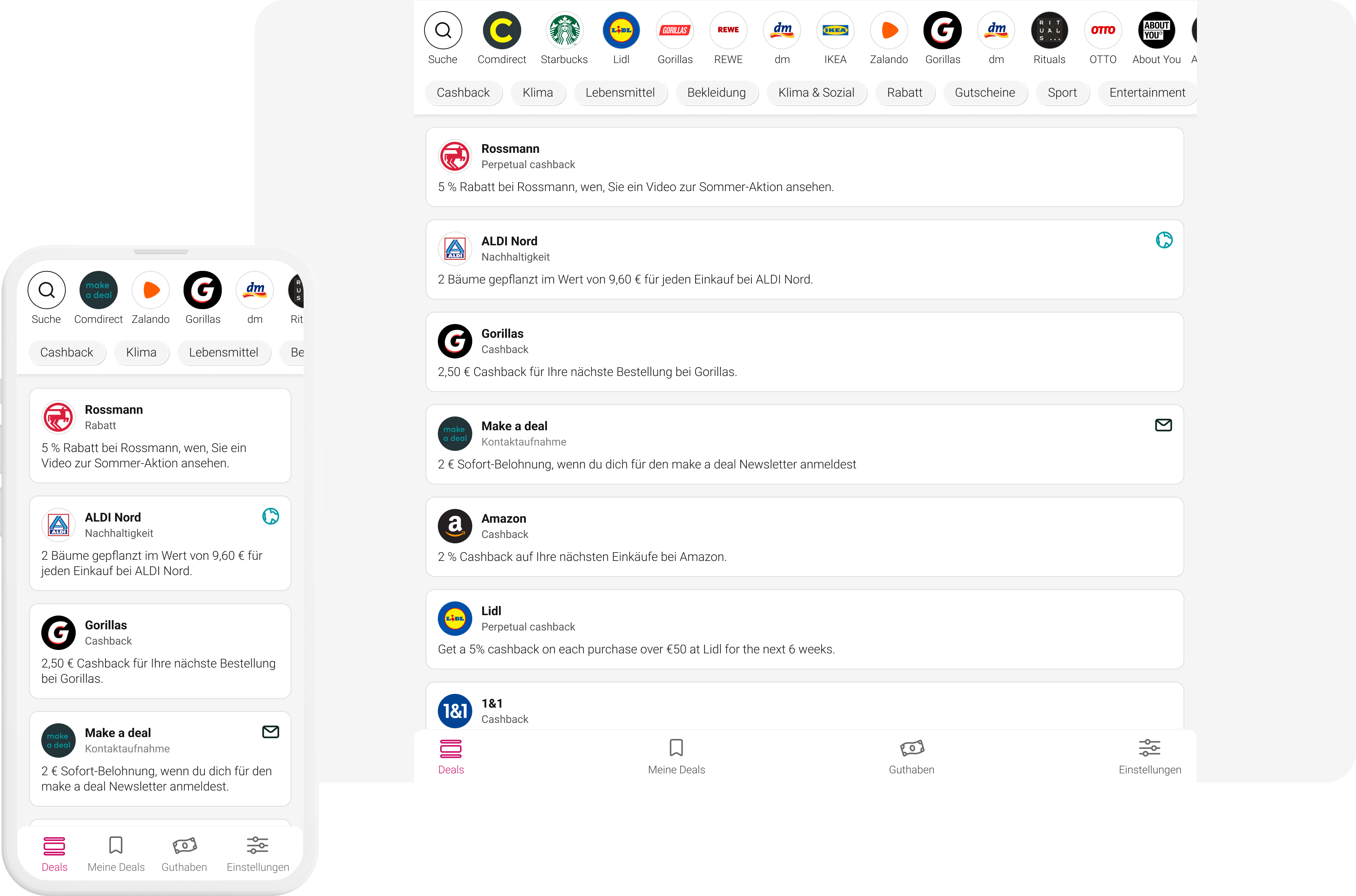
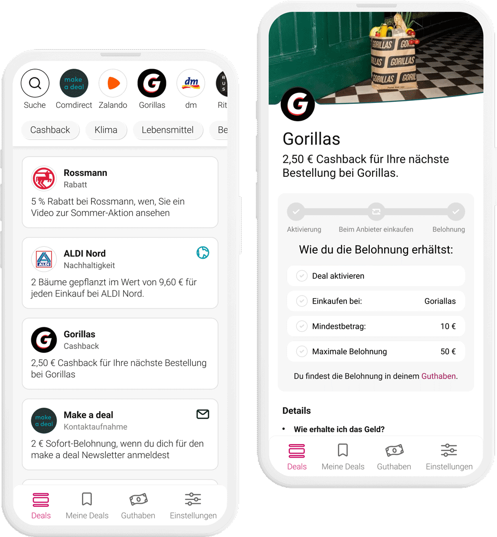
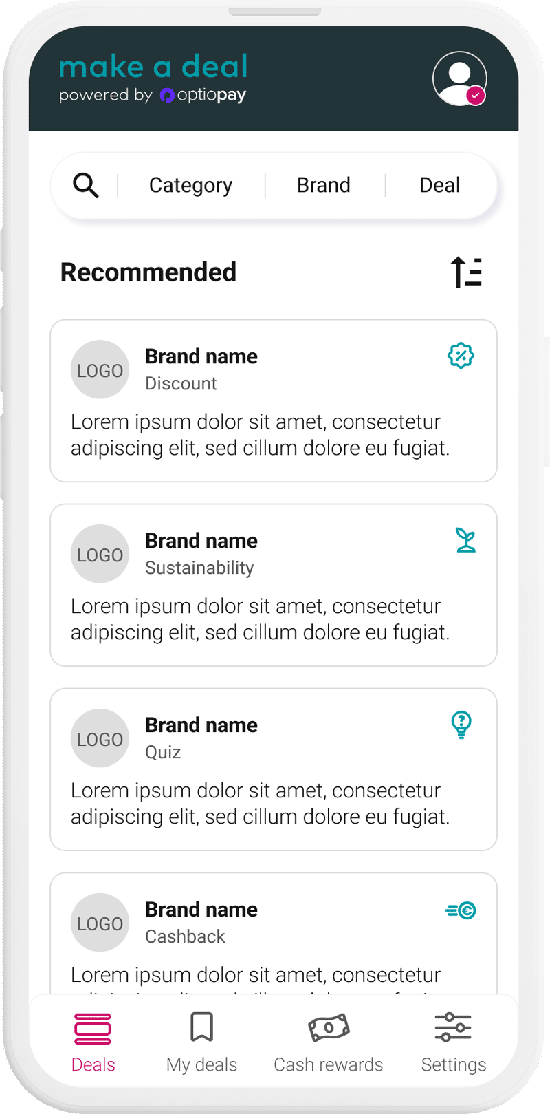
Make a deal is a responsive web application based on open banking. Similar to a loyalty platform users can make use of cashback deals for different brands and get money back for their purchases.

Image
Project overview
ImageImage
UX Research efforts step by step
Step 01
Evaluate user behaviour with analytics tool
For the product launch the lead designer assigned a lot of prominent screen space to the filter chips so that users can efficiently find and activate relevant deals. However, due to the Operation's team categorisation, we launched with a vast amount of filter chips. HotJar as our analytics tool revealed that the users don't interact with the filters. In order to improve the conversion rate, we needed to improve the filter bar.
Image
Step 02
Have short interviews with user base
In phone calls we asked for users' initial feedback on the platform. Also, a major goal was to recruit users to participate in the planned usability tests.
Image
Step 03
Redesign of filter logic and internal testing

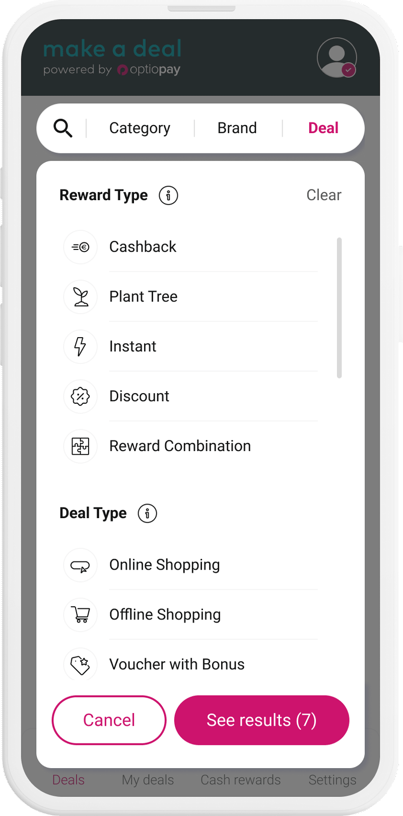
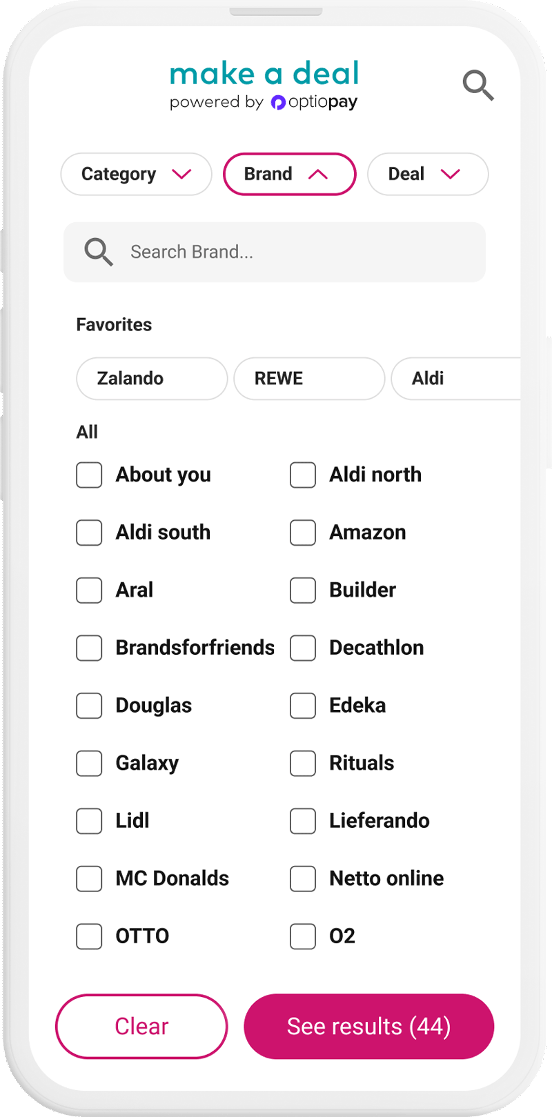
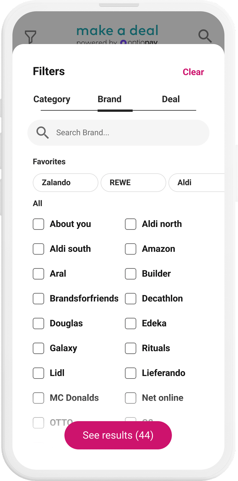
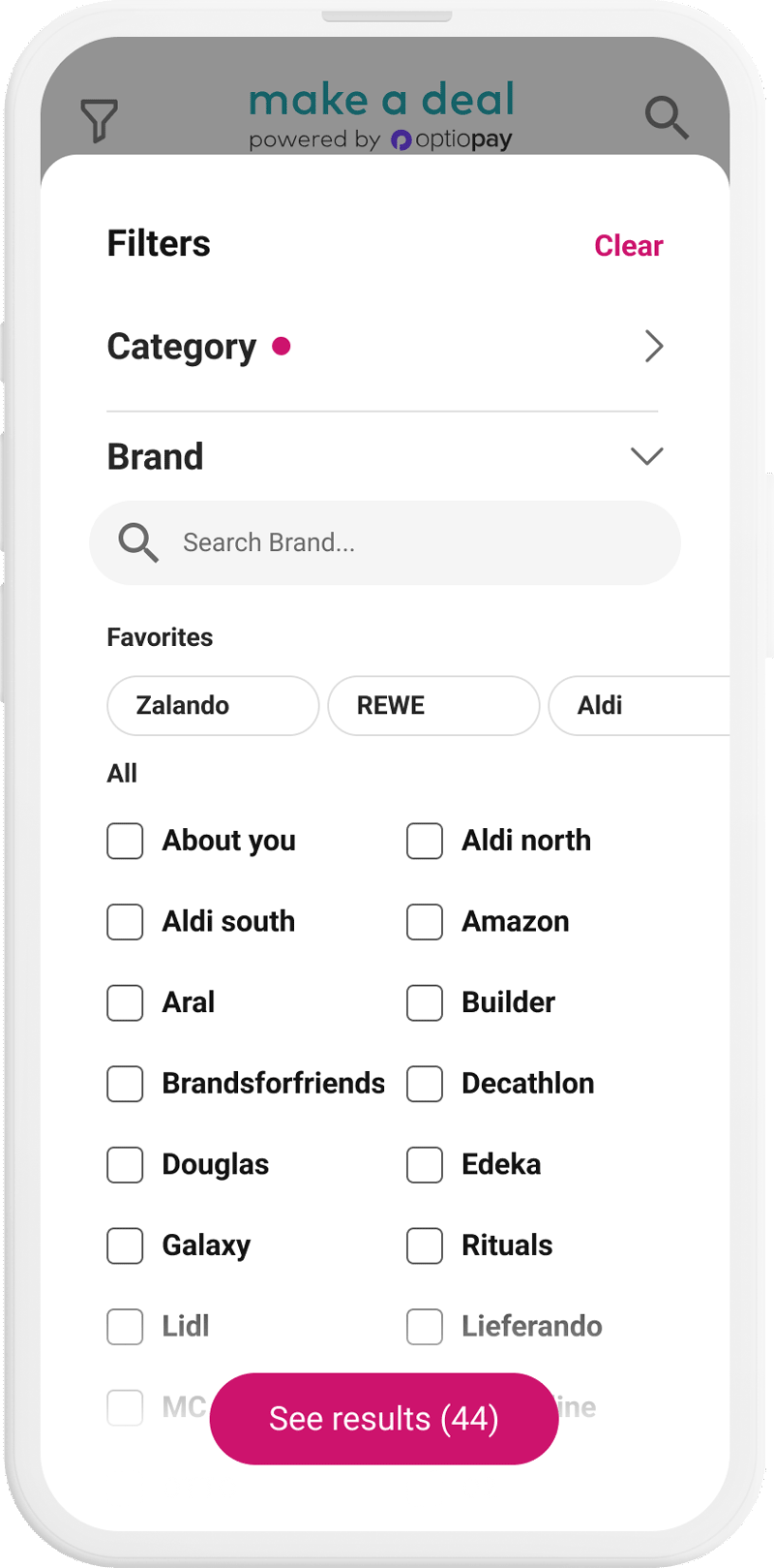
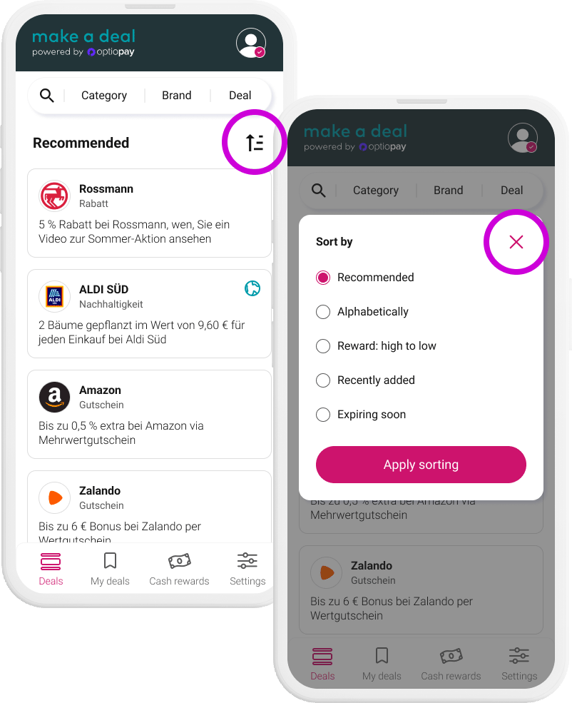
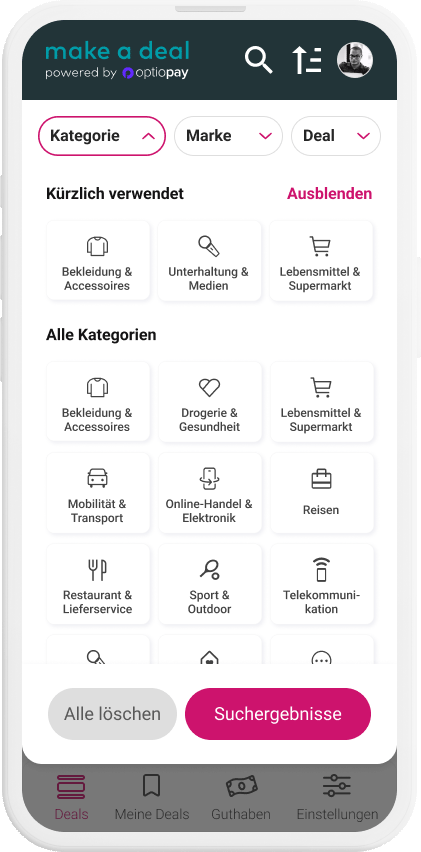
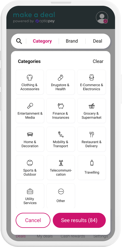
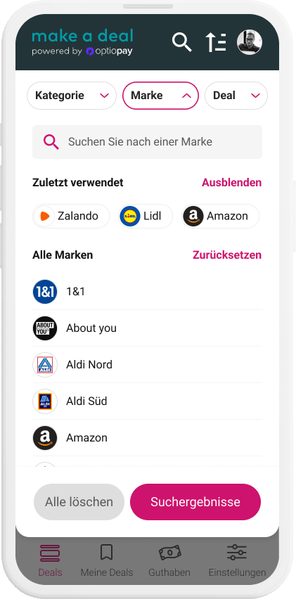
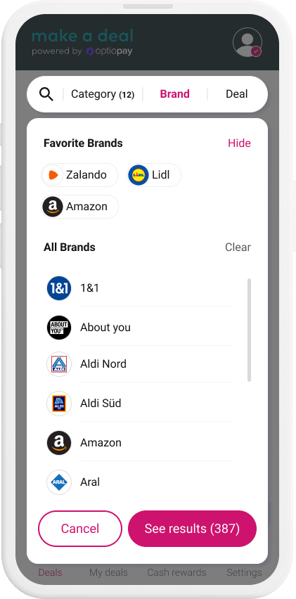
We came up with a design where the filters are clustered into meaningful groups. All the options from before are still covered: industry branches, brands and reward types.

We carried out 5 internal tests to select the most intuitive option from 3 redesigned versions of the filter logic.


Version A was the best performing in the usability testing because it was most intuitive, the fastest and directly visible. Whereas the filter icon from versions B and C were overlooked.

UI of launch - Filters in horizontally scrollable filter chips
Version A - Filters stay sticky and options appear in a dropdown overlay
Version B - Filters in an overlay with segmented control
Version C - Filters in an overlay with expansion panel
Image
Image
Version B - Filters overlay with segmented control
Image
Version C - Filters in an overlay with expansion panel
Image
Step 04
Carry out 11 usability tests with participants from user base

We tested the current Make a deal version with 11 users in virtual calls to deepen our understanding of how they use our product and what causes friction. We also gathered demographic and psychographic data about our user base for the first time since the launch.


The main purpose of the research session was to improve the usability of the new filter logic. We asked the participants about their first impression and let them carry out test scenarios.

After we created an affinity map, we presented the insights to Product Management and agreed on the action items.

Image
Step 05
Design iteration and internal test to validate design decisions

After the extensive research round with current users of the platform, we conducted another rapid usability tests with co-workers to validate the UX and UI changes.

To conclude the research project, I created a report and presented the insights about the user base and the design iteration company wide.

Prototype from testing
Image
Final UI of main screen
Image
Outcome of the research
The profile image was removed

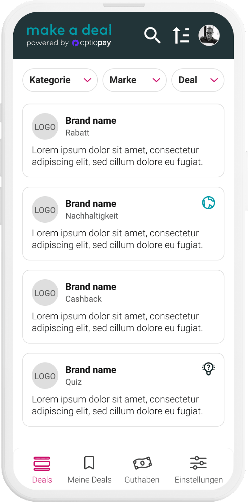
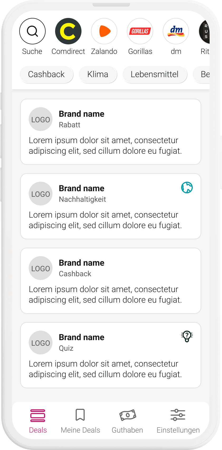
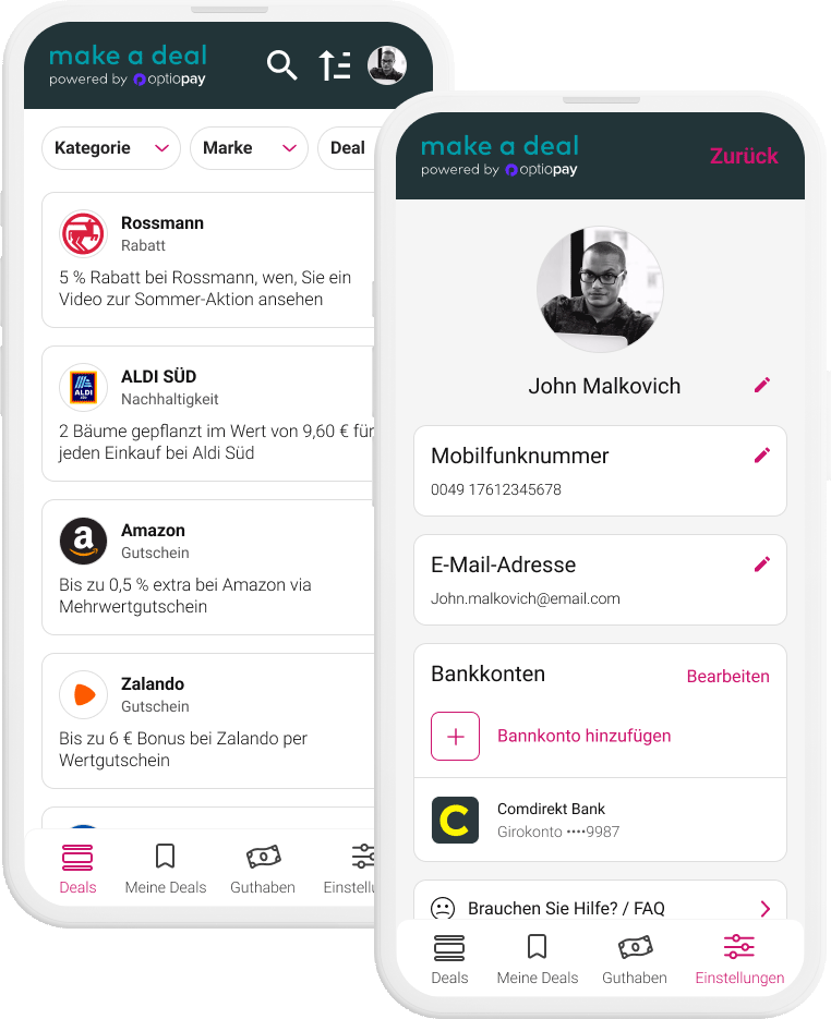
Users feedbacked that they would not spend time on selecting a profile image for such a product because it does not serve any function.
We decided to use the users’ initials or a generic user icon instead.

Before
Image
Final design
Image
The sorting function was repositioned
Sorting was a celebrated functionality added to the live-version. The testing made clear that the icon should be set more into context closer to the list of deals. To make the selection more intuitive, we added a CTA. We moved the exit option also more into context within the overlay.
Before
Image
Final design
Image
Selecting industries for Cashback deals was streamlined

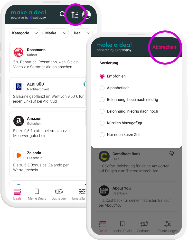
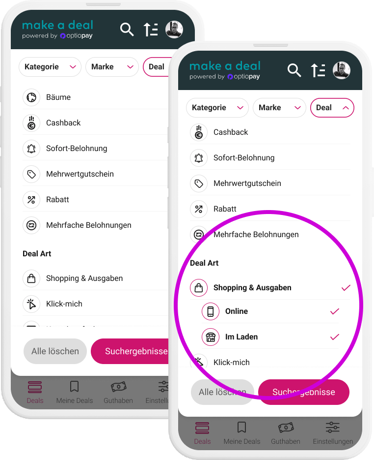
Participants preferred accessing the different industries efficiently by getting used to them in the same position. It was less useful to them to see the recently used industry branches.


We changed the secondary CTA into to let users get out of the process.

Before
Image
Final design
Image
The Brand filter was simplified
The duplication of the search confused participants. It was removed from the Brand filter and placed in proximity to related functionalities. “Last used” brands were replaced by favourite brands because they are more useful in an application they return to regularly.
Before
Image
Final design
Image
We help users to learn about reward types and highlight the relevant ones

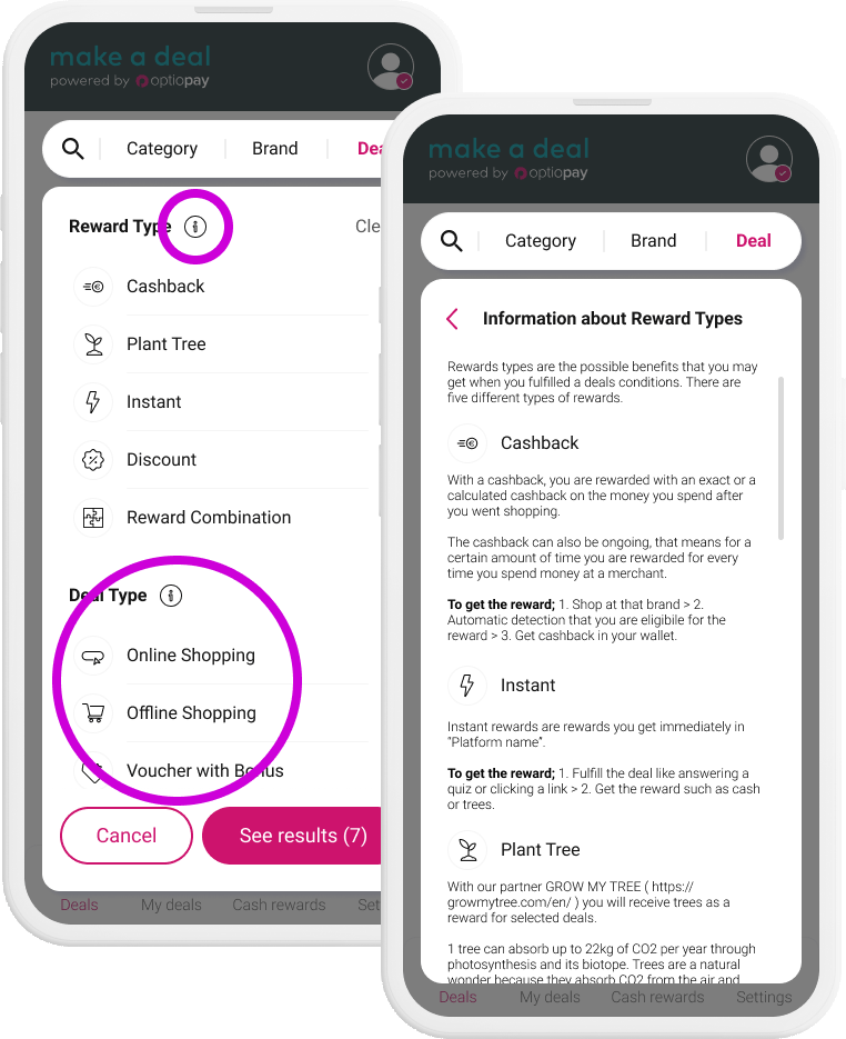
We learned that the Deal and Reward types are not easily understood. Participants wished for an explanation. Also the icons were changed to a more intuitive and customised design to explain the use case.

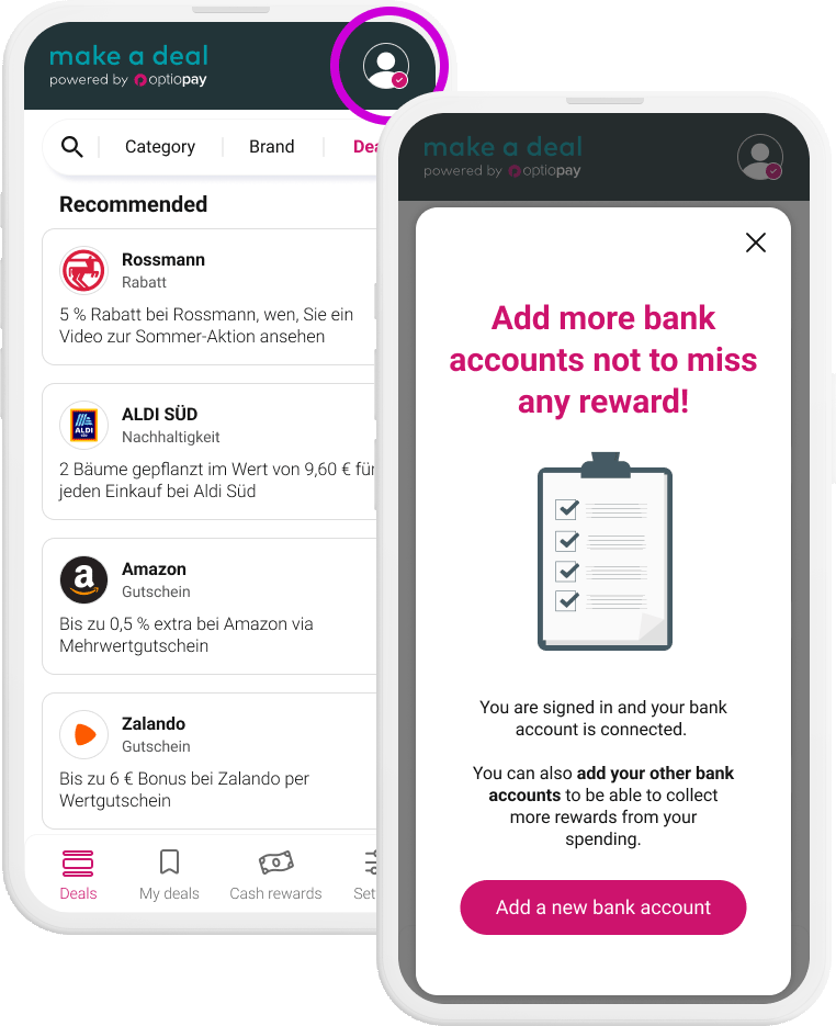
It was important for users to be able to select deals for online and offline shopping right away according to their shopping preference, which was placed within an expansion panel. They were added as separate options.

Before
Image
Final design
Image
Project Summary

With the help of quantitative and qualitative data we could refine the designs and make the interaction on point:  

  • We removed functional duplications and streamlined the positioning of the elements
  • We optimized the filter selection
  • We educate about the deal and reward types
  • We discarded the profile picture
Filter for industries
Image
Brand filter
Image
Filter about reward and deal types
Image
    Filter for industries
    Image
    Brand filter
    Image
    Filter about reward and deal types
    Image